Lately, I’ve been diving deep into lettering—because it’s an often overlooked but essential parts of comics. This is my second post on the topic, leading up to a lettering workshop I’m co-hosting on March 25 with designer Susannah Hainley.
Good lettering can make or break a comic. The right font, size, and placement enhances readability and storytelling, while poor lettering can pull readers out of the experience. Here are five key things to consider when laying out your text in comics:
1. Choose a Font That Matches Your Art
Your font should complement both the art style and mood of your story.
For example, here’s a panel from my first (unpublished) graphic novel. I used a traditional comics font, but it doesn’t work with the woodcut-inspired art style. The lettering feels out of place with the art:
Compare that to the version where I used a font based on my handwriting—it blends much better with the artwork and enhances the tone of the story:
(My speech bubbles don’t match my art style, but that’s a whole other issue)
2. Keep Font Size Consistent
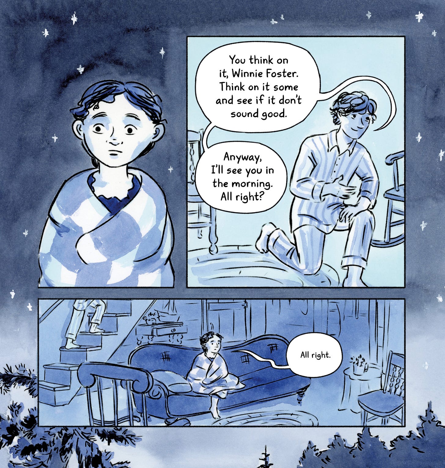
In general, it’s good practice to keep dialogue at the same size throughout a comic. However, you can adjust text size for emphasis—making it larger and bold for shouting or smaller and airy for whispers as in Tuck Everlasting when Winnie is whispering in the final panel:
So, what’s the right font size? It depends on several factors, including the font itself, page size, and audience (kids’ comics often use larger text). The best way to determine if your text is readable? Print out a page at actual size. I tell this to every cartoonist I coach, and it ends up being incredibly helpful who those who do it.
3. Place Text Before Drawing Speech Bubbles
I recommend laying out your text first, then drawing the speech bubble around it afterwards. If you do the opposite, you risk cramming words into a space that’s too small. Also, try to maintain a consistent amount of space between the text and the edges of the bubble.

If you adjust that spacing, do so intentionally. For example, in The Great Gatsby, I made Tom Buchanan’s text uncomfortably close to the edges of his speech bubbles—just like he barely fit into his clothes, I wanted his words to feel squeezed in as well.
4. Prioritize Legibility
Messy or hard-to-read lettering pulls readers out of the story. Even if you hand-letter, there are simple ways to keep it clean and readable. I break down four techniques—like using guides, tracing fonts, and creating your own font—in this post from a few weeks ago.
5. Guide the Reader’s Eye with Intentional Text Placement
Lettering should follow a natural reading flow, leading the reader smoothly through the page. In most Western comics, this means placing text from left to right and top to bottom, following the way we read text.
This means readers will typically look at the speech bubbles starting from the upper left, then move to the right, and finally down to the left again.
I see beginning cartoonists frequently make the mistake at right (as did I when I was starting out) where the reader doesn’t know which panel they’re supposed to read next. This happens a lot with artists who read manga and unconsciously structure their pages in a right-to-left format.
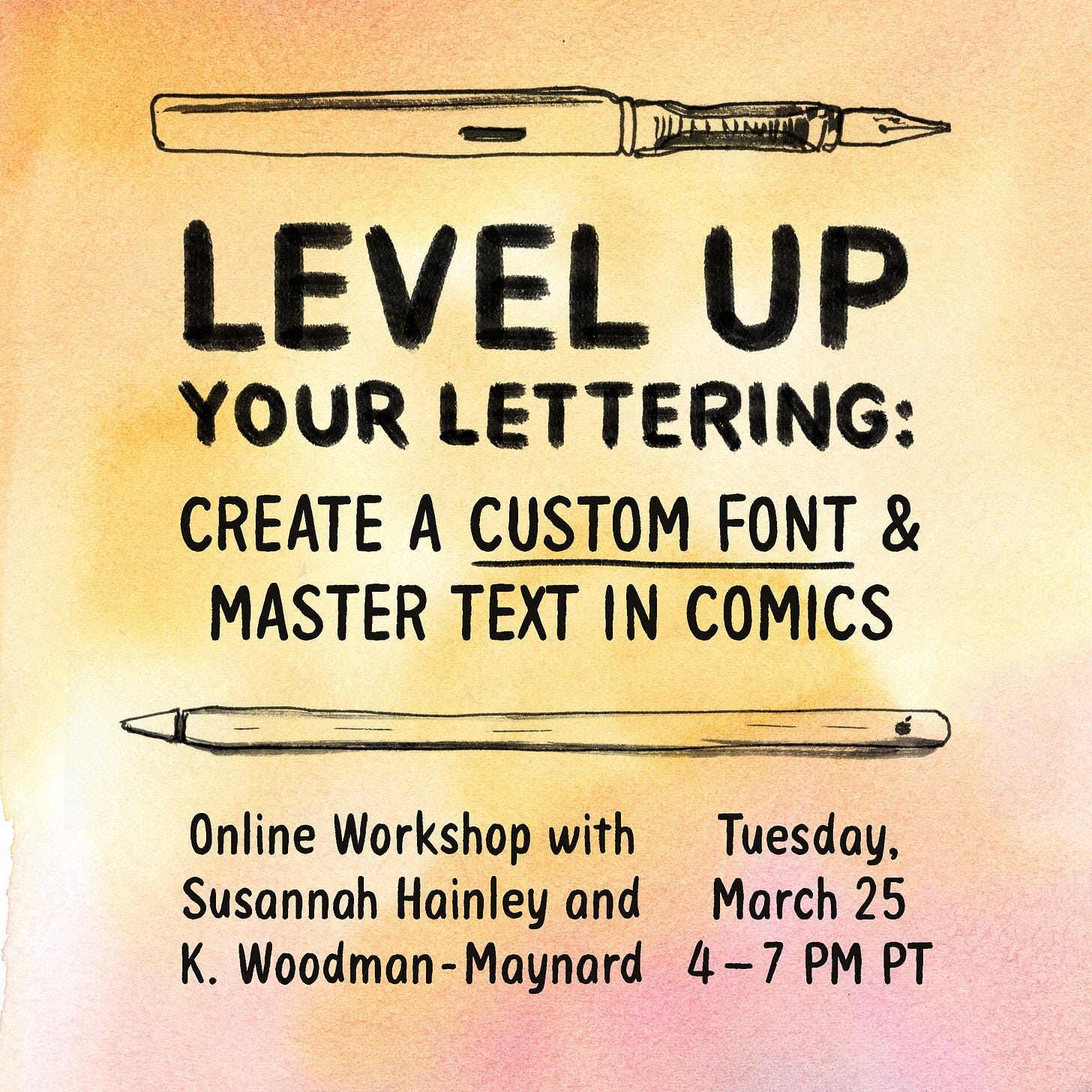
Level Up Your Lettering
Want to Make Your Own Font?
If you’re curious to learn more about lettering and making your own font, I’m co-hosting a lettering workshop with cartoonist and designer Susannah Hainley on March 25.
We’re offering this workshop because lettering is one of the biggest struggles we see among our students. Having our own fonts has made a huge difference in our work, and we want to help others do the same!
Book Launch - St. Paul, MN
Tuesday, March 18 at 6:30 PM CST
Red Balloon Bookshop, St. Paul
I’ll be moderating the book launches of two wonderful graphic novels: Extra Large by Tyler Page and Botticelli’s Apprentice by Ursula Murray Husted. If you're in the area, come say hello and hear us chat about comics and storytelling!
Leif Love
Leif has been quite bored while my spouse and I recover from a nasty bout of the flu. Here he is, bowing before us, begging for our return to health (we’re working on it!)
Take care and keep creating!
-Katharine


Hi! This is great stuff, thanks for share. Your last point got me thinking 🤔. In comic design what should guide the reader's eyes? Is the text (from your post seems like text could be important in that task), the panels, the action, everything together? How would you be sure that you're providing the right sequence despite of the format (comic or Manga)? Thanks 😊
Hi Katherine! I'm really interested in your lettering workshop. Do you know if FontSelf fonts will work in Clip Studio Paint also? Thanks--