


The Talking Heads Trap
How to Avoid a Common Mistake in Comics Storytelling

One of the most common habits I see among beginning cartoonists is leaning too heavily on a single shot type—usually the classic “talking heads” shot. This is a straightforward shot where a character’s heads and shoulders are shown as they talk.
And honestly, I get why you’d use this pose—it’s much easier to draw than full-body shots or unusual camera angles. And while there’s nothing wrong with this shot (I use it in my comics too!), relying on it too much can make your pages feel visually repetitive and boring.
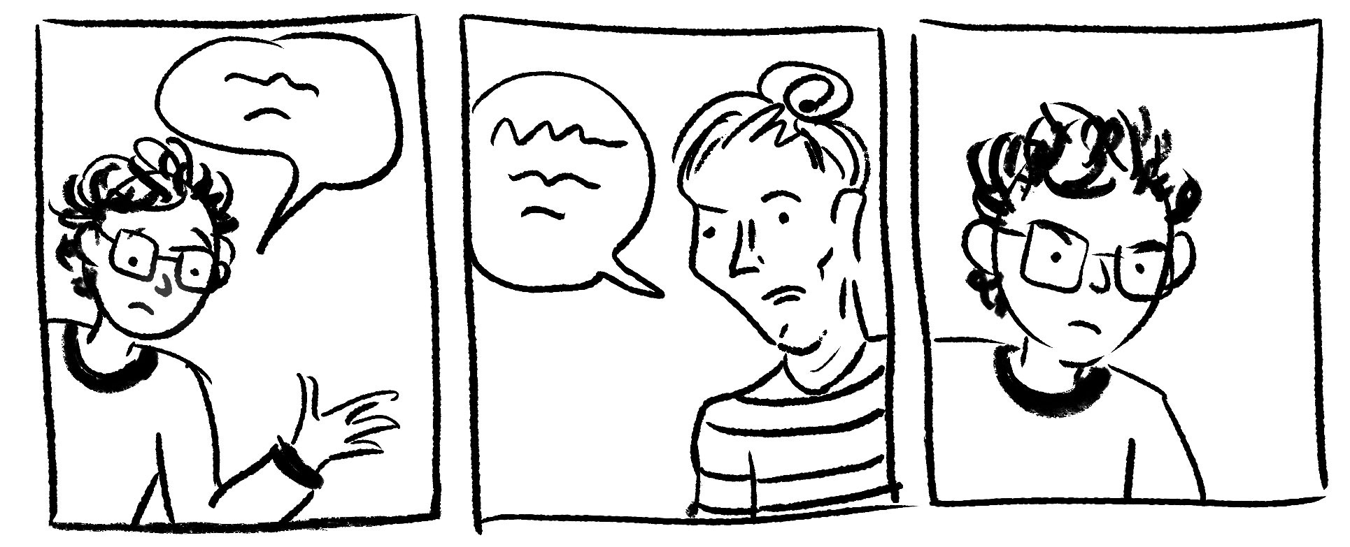
When cartoonists overuse the talking heads shot, they miss out on opportunities to deepen their storytelling. This is a challenge I often tackle with my comics coaching clients—exploring how a wider range of panels can do so much more than just show who’s speaking. By varying compositions, we can reveal more information about the characters, set the mood, and even reinforce the themes of the story.
Techniques to keep comic pages dynamic and engaging:
1. Vary Your Shots
There’s a world of shot types beyond talking heads. Cartoonist Wally Wood’s famous graphic on panel variety is an excellent resource to keep handy for inspiration:
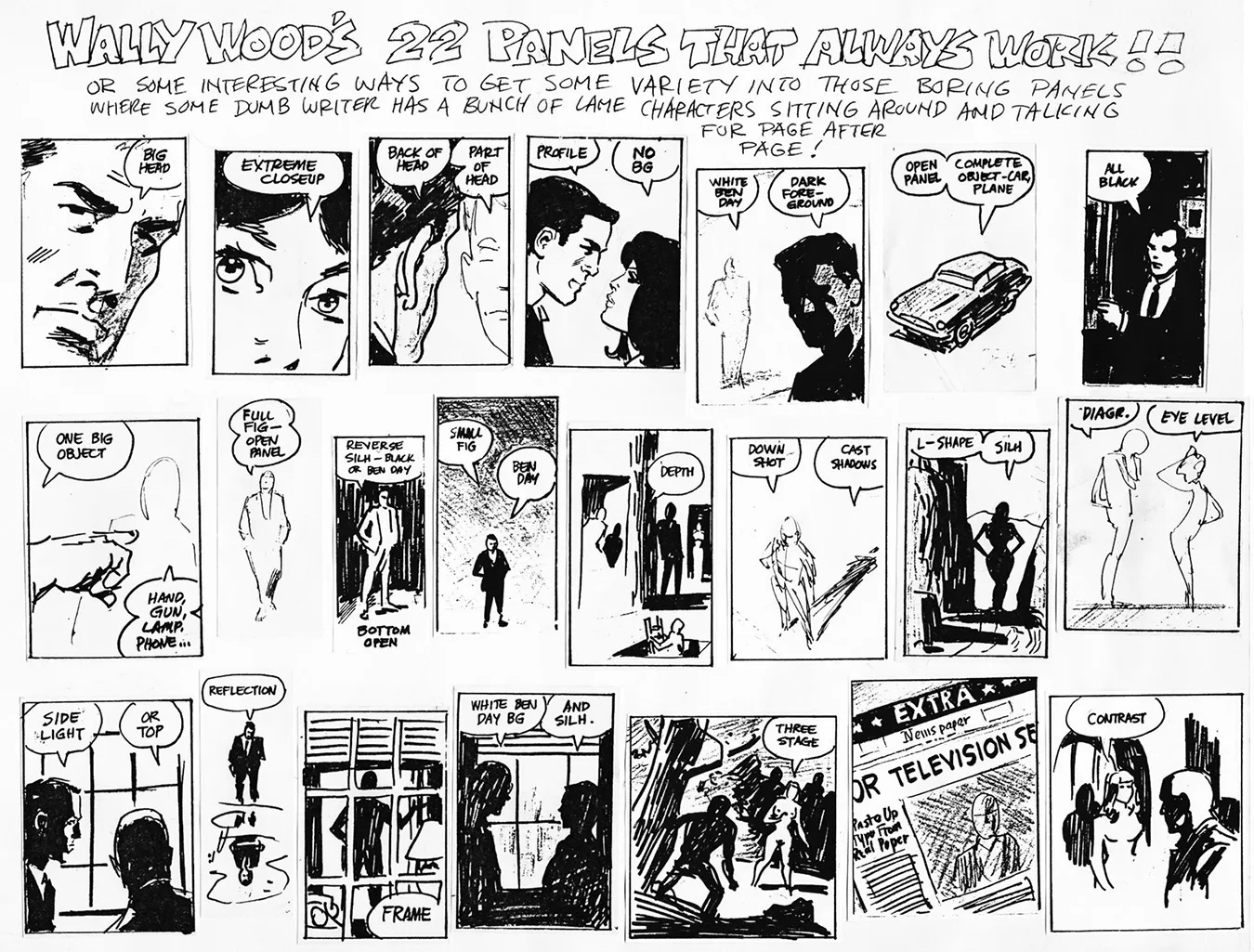
Think about changing the angle, adjusting the composition, experimenting with shadows and contrast, and incorporating elements of the environment like a shot through a window or a reflection in water. Mixing these elements not only makes your work more visually interesting, but also enhances the emotional tone of the scene which is something I’m always thinking about as a graphic novelist.
2. Focus on the Landscape or Objects
Another way to break up repetitive panels is to shift focus away from the characters altogether. Highlighting an element of the environment—the landscape, an element of nature, an object, or even an animal—can create a welcome and meaningful visual change.
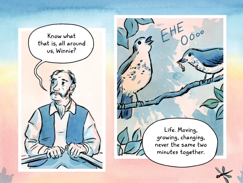
For example, in my adaptation of Natalie Babbitt’s Tuck Everlasting (coming in 2025), there’s a scene where Angus Tuck is speaking for a long time about mortality while sitting in a rowboat. In the above panels, I first establish that Angus Tuck is the character talking, but then I have his conversation overlap an image of two birds. This approach not only helps set the place of the scene, but ties into the story’s themes of nature and the cycle of life, as one bird is eating a worm. You can add a lot more information about your story if you don’t only focus on talking heads.
3. Give Your Characters Something to Do
In real life, people rarely stand still while talking. They fidget, move, or engage in tasks. This was made famous in the TV show The West Wing where it’s called a Walk and Talk, when characters would have fast-paced conversations as they walk around the White House. By giving your characters something to do while they speak, you add a dynamism to the story and make the scene more engaging for the reader.
Actions can also reveal character traits and meaning. A character who’s always fiddling with a pocket knife might seem menacing, while one who constantly tidies up could be conveying a need for control.
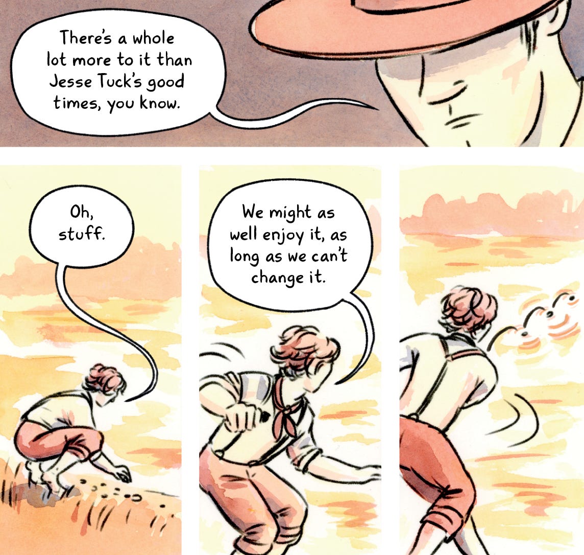
For example, in Tuck Everlasting, I showed Jesse Tuck skipping rocks while speaking. Not only does this align with his active personality, but it also reinforces the story’s circular imagery, which symbolizes the cycle of life—a major theme of the book.
Case Study: Reworking a Scene for Greater Impact
Here’s an example from my adaptation of The Great Gatsby. In an early sketch of a dinner party scene, I relied too much on talking head shots.

While this scene is functional, these panels don’t capture the tense mood of the moment: the host’s mistress calls during dinner, prompting him to excuse himself, followed by his upset wife. The remaining guests sit awkwardly, waiting.
To bring out the tension, I redrew the scene with a more dynamic layout and shots:

I used extreme closeups of clenching hands, a napkin being twisted, and a forced smile. I zoomed out on the dining table where the hosts are missing and I removed the panels around it to emphasize the emptiness and awkwardness of the situation. These choices helped evoke the unspoken emotions of the characters. Then I layered in my watercolor, using contrasts and intensity to emphasize the mood shifts. All in all, the variation vastly improved the page spread.
What about you?
What kinds of shots do you like to see in comics—or draw yourself? Share your thoughts in the comments below!
Leif love
We’ve all been adjusting to chilly temperatures here in Minnesota and looking forward to some hopefully snowy days ahead!

Take care and keep creating!
-Katharine
P.S. For my paid subscribers, last week I had a video post on Gap and Gain Thinking for Artists and Writers, which is about a mindset shift that really helped me be both more positive and productive.
This is such good advice!!! And something you’ve always helped me with! It’s such a good reminder that even though Tom leaving and Daisy following can be adequately communicated in two panels, adding a few close ups really heightens the suspense and tension and elevates the mood. I always remind myself not to rush through those moments that matter.
I love this post! One of the things I love about comics is the ability to show scenes from all sorts of angles, and this gets to the heart of that, but even deeper! I never really thought about how you can even show things that others might not see (clenched hands on the napkin), which totally adds a new dimension for the reader.