Why Panel Borders Matter: Exploring Strokes and Style
Small choices that transform the tone and impact of your comic
When I work with cartoonists—whether beginners or more experienced creators—I often notice that panel borders get less attention compared to the interior art. Yet even the smallest choices in panel borders can profoundly shape the emotion of a page and elevate a comic to the next level.
In this post, I use panels from my graphic novel adaptation of Natalie Babbitt’s Tuck Everlasting (coming September 2025) where I photoshopped in different panel border styles to demonstrate how these subtle changes can transform the tone of a comic.
Here’s an overview:
Now let’s dig into each of these variations…
Don’t make panel borders an afterthought
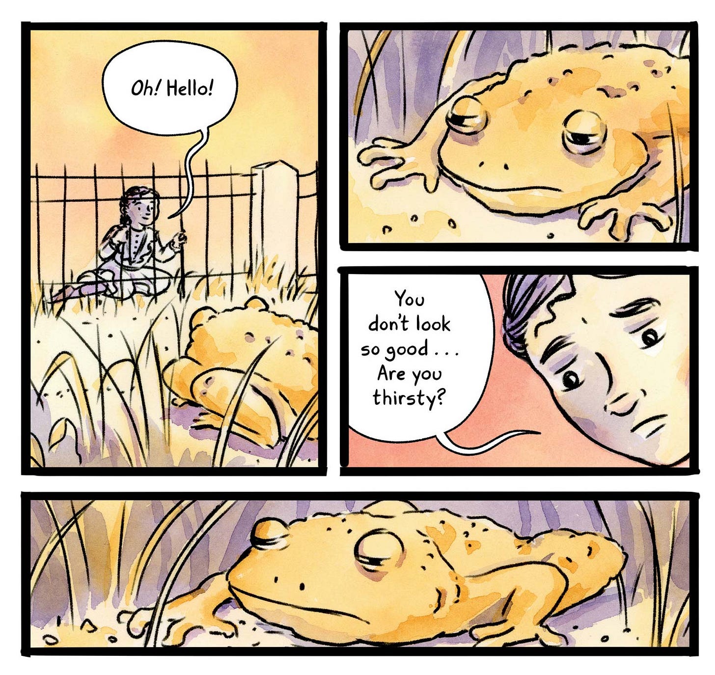
When choosing your panel borders, think about how they will interact with your interior art. Panel borders are the container which holds the art, and will affect the reader’s experience of the page. If it’s too thick and clunky (as above) and your art is delicate and light, it will diminish the art you spent so long creating. That said, sometimes such a thick and clunky line might actually match a heaviness that one is trying to convey.
Straight edge with stroke matching the interior art
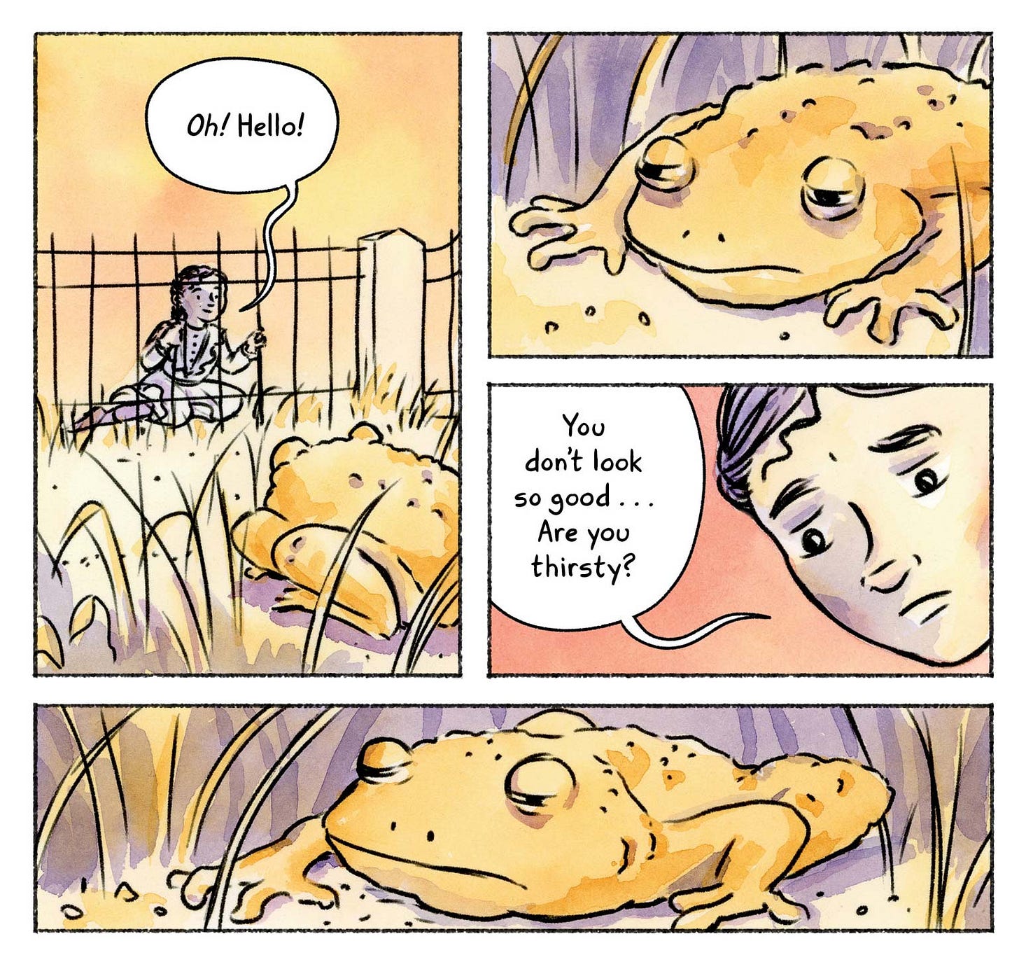
Here I have added in a thin panel border created with a digital ruler. I think the straight edge gives a level of polish and cohesion to my work which can sometimes be a bit loose. The stroke style is similar to the line art used in the comic so it doesn’t distract from the art in the comic.
This is similar to the panel border treatment I used in The Great Gatsby: A Graphic Novel Adaptation. While I considered this option for Tuck Everlasting, I felt it resulted in a sense of feeling constrained which wasn’t the mood I wanted thematically for this book.
Hand-drawn with stroke matching interior art
Here I hand-drew the panel borders, not using a straight edge. I like the handmade feel, but I think it adds a little uncertainty to a scene which could work well in some stories, but less well in others.
No gap between the panels
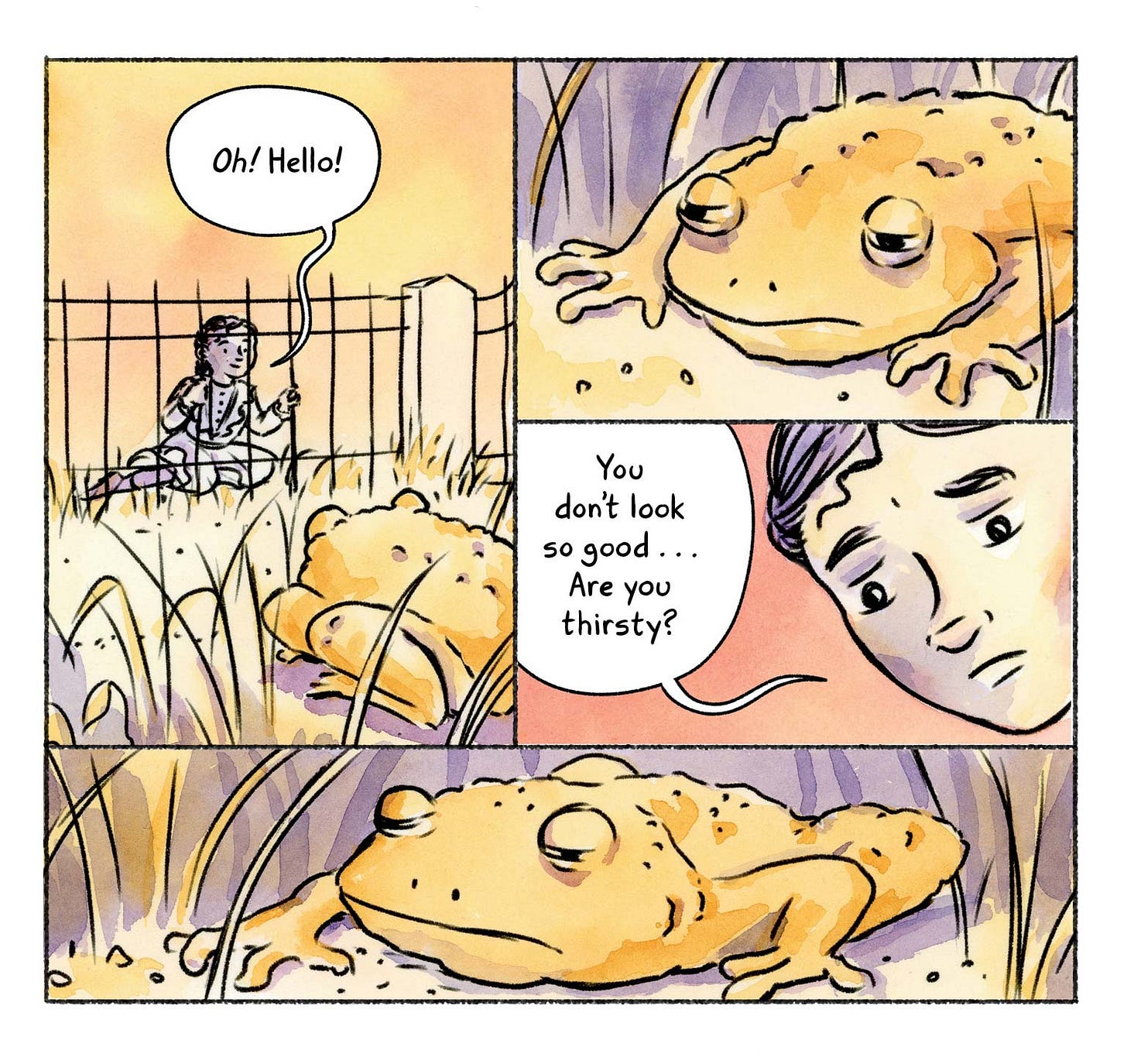
Removing the white from inside the panel borders so that there’s very little gap between the art in each panel is an interesting effect. I see a lot of beginning cartoonists use this option since they don’t really want to deal with drawing out all the panels (which can be a bit of a pain). While I think this can work in some graphic novels, I’d be worried about it making the page too dense and also decreasing readability at times with the panels sort of blurring into each other.
No stroke at all
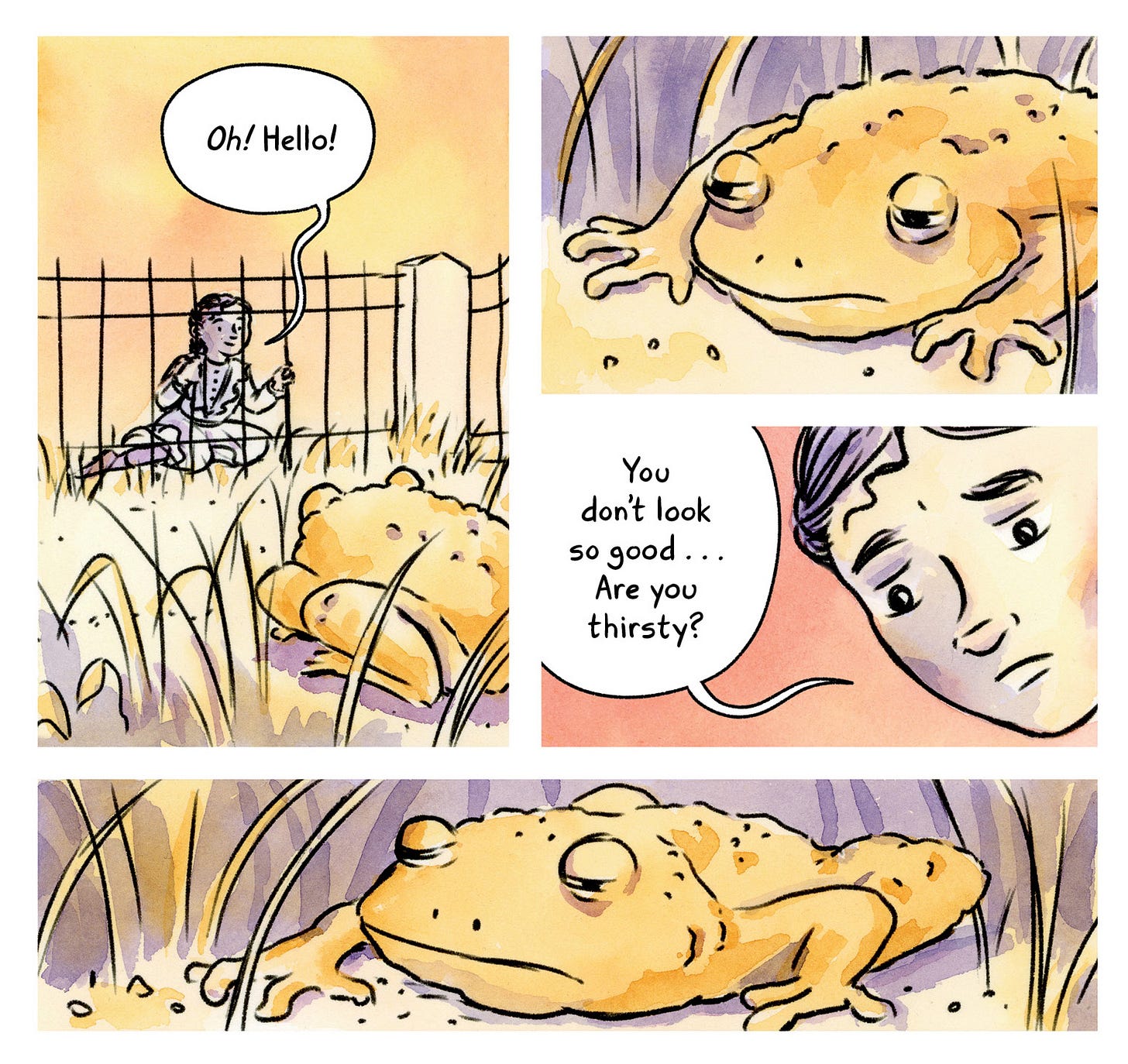
For my graphic novel adaptation of Natalie Babbitt’s Tuck Everlasting, I chose not use any strokes on the panel borders since I liked the airiness and feeling of freedom it brought which tied into the themes of the story. The art also felt more modern without the strokes, which seemed important for a book that I wanted to appeal to modern children even though it takes place in 1880.
While I used this technique through the majority of the book, occasionally I would add panel border strokes to scenes that took place at night where I felt the bright white would be distracting against a dark backdrop, as I did here:
Remember, there are so many options in for panel borders, and many more than these! I recommend taking a page and experimenting when you start out a comics project to figure out the option that feels best for the story.
What about you?
How do these different panel border styles make you feel? There are no right answers. Let me know in the comments below!
Work with me
If you’re interested in learning more about how you can better maximize the graphic novel medium, consider working with me. I offer a few different types of comics coaching and consulting and I love working with comic creators at any experience level:
Other comics technique deep dives:
If you enjoy this post about the more technical aspects of comic-making, here are a few of my other Substack posts along these lines:
Leif love
Our vizsla, Leif, had his first skijoring race last week and he got second overall (out of two) and first in the male human category. He even won us a little money! But more importantly, he won himself a new dog bowl so we can replace his current bowl reading KITTY with one reading “TOP DOG.”
It’s a high of -3 degrees F here in Minnesota today, so I hope everyone is safe and comfortable wherever they may be.
Take care and keep creating!
-Katharine


Ooooh, I'm working on a newsletter this week about layout and white space just in regular text pages and how I don't think we writers play enough, and I'm definitely gonna reference this post. Because this idea of the feel of how a page looks is exactly what I'm getting at, and even in non-graphic novels I think we still have room to play with stuff like that!
Katherine, your well-done explanations and excellent visual examples help my untrained eye understand the intention behind the panel borders.